

7 Top Salesforce Reporting Tools for 2023

You’ve chosen Salesforce because it’s a powerful cloud-based customer relationship management platform that helps you capture, store, and analyze customer data. However, as a Salesforce user, you know the pain of using its built-in reporting features.
Limited customization, manual data entry, complex data structures, and unreliable results — these are just a few of the challenges you’re facing every day.
But what if you could finally overcome these problems and access adequate reporting right in Salesforce? You would be able to focus on more important tasks instead of spending hours manually entering data or figuring out how to create a specific Salesforce report.
The good news is that you can make it all possible by adding a Salesforce reporting tool to your tech stack.
1. Weflow

Weflow is a tool built specifically for Salesforce users. It syncs with your Salesforce account and simplifies painful processes for your sales team.
Weflow automates data entry tasks, eliminating human error and speeding up the process of creating reports. It lets you easily log any activity and sync it to Salesforce. This is one of the biggest time-savers in Weflow.
Improved Salesforce data quality and process compliance allow Weflow users to achieve 92% forecasting accuracy.
Additionally, note-taking is finally made easy with Weflow. You can create and format notes in a rich-media editor, save and reuse templates, and connect your notes to specific contacts.
This helps you quickly generate and access more data to make informed decisions.
Weflow also features a modern reporting interface for pipeline and deal inspections.

Its task and sales pipeline management features help sales teams become more productive and help improve pipeline visibility.
Pricing
- Weflow offers a free Chrome extension that allows you to update your pipeline, create notes, manage tasks, and add new records with ease.
- Paid plans start at $39 per user/month, and include shared table and Kanban views, note templates, bulk editing, deal signals, and more.
What users say about Weflow
“With Weflow, data quality has improved massively, allowing us to see exactly what's going on as reps update records in real-time. It has not only become a tool for our day-to-day workflow but also enables more robust reporting.
Certainly wouldn't want to miss out as it perfectly complements Salesforce's strengths and fills its gaps.”
— Robert Anders, Vice President at Cremanski & Company
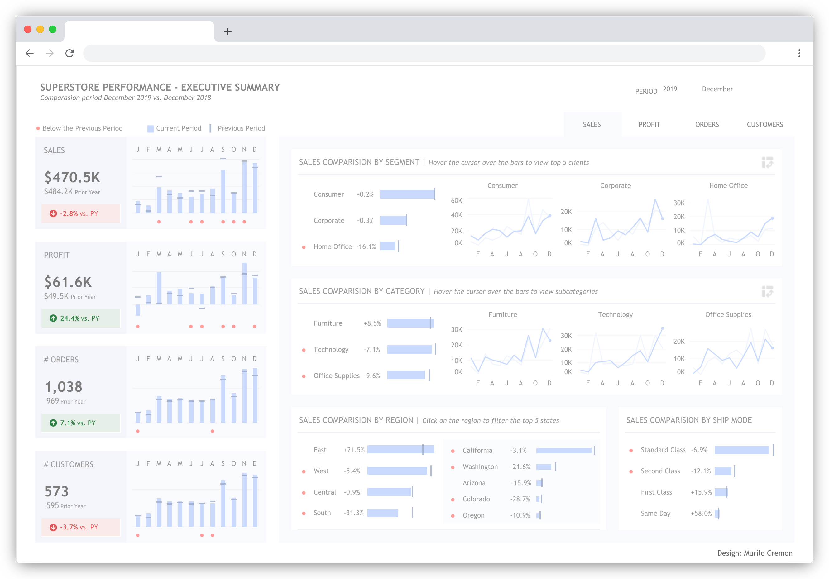
2. Tableau
Tableau is a business intelligence and data visualization platform for enterprise companies. It integrates with a range of business tools, including Salesforce.
How Tableau improves Salesforce reporting:
- Tableau collects relevant data from Salesforce CRM to let you visualize the metrics that matter to your business.
- It allows you to connect directly to Salesforce and integrate external data in a single location.
- The tool creates AI-powered predictions and recommendations based on the data it gets from your Salesforce account.
Pricing
- The most basic Tableau plan starts at $15/month (billed annually).
- Customization options are available starting at $42/month.
What users say about Tableau
“We use Tableau to generate reports on data sets that are external to other tools we use, or where those tools have insufficient reporting capabilities. It has become a keystone of our reporting portfolio, and with the right analyst it is now providing us with beautiful reports for clients and internal purposes alike.”
— Abe Blackburn, Director of Technical Solutions at The Social Element
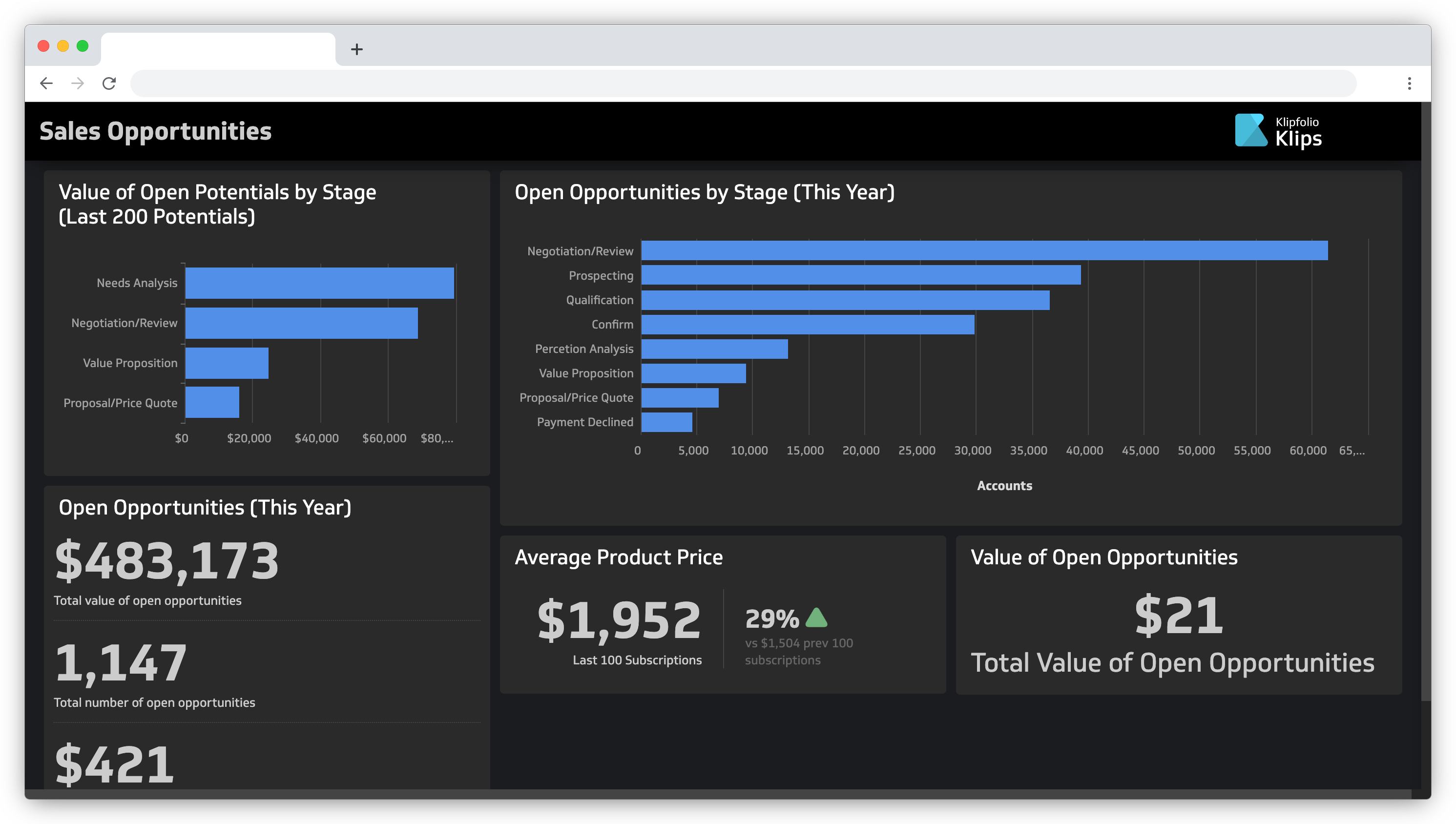
3. Klipfolio
Klipfolio is a cloud-based dashboard and reporting platform that connects to multiple data sources. Similar to Tableau, Klipfolio wasn’t built for Salesforce specifically, but you can connect it to your Salesforce account to generate insightful custom dashboards.
How Klipfolio improves Salesforce reporting:
- Klip Editor lets you design and build custom visualizations with your Salesforce data.
- Klipfolio offers a range of pre-built metrics that you can snap together into insightful dashboards in a few clicks.
- Interactive dashboards allow you to assess your sales team’s performance at a glance.
- Users can create beautiful TV dashboards to democratize their Salesforce data and present it during company meetings.
Pricing
- You can try Klipfolio for 14 days, free of charge.
- Paid plans start at $99/month, billed annually.
What users say about Klipfolio
“Klipfolio is a user-friendly way of visualizing data from multiple sources. You don't really need the same level of analytics background that would be needed with something more complex like Tableau – if you can write an Excel formula, you can build dashboards.”
— Jordan Decker, VP of Demand Generation at Tebra
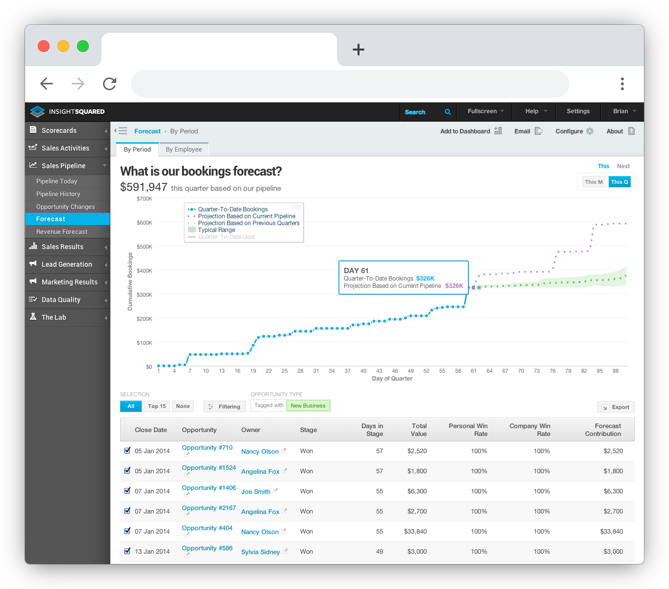
4. InsightSquared

InsightSquared is Mediafly’s revenue intelligence platform that facilitates pipeline management and forecasting. The platform includes analytics and visualization tools that make it easier to access, analyze, and visualize data from Salesforce.
How InsightSquared improves Salesforce reporting:
- RevOps dashboards are updated in real-time to provide you with immediate access to critical data.
- InsightSquared’s Activity Capture feature generates reports on your team’s activities and sends the data to your Salesforce account.
- The tool enables automated activity tracking to eliminate manual activity updates and improve your sales team’s productivity.
Pricing
InsightSquared offers flexible licensing based on your role and needs. You can request a quote to learn about available pricing options.
What users say about InsightSquared
“Our reps have a much easier time keeping their Salesforce clean, so the reps are happy and management is too.”
— Eli Berman, Director of Sales Operations at Zixi
5. Domo
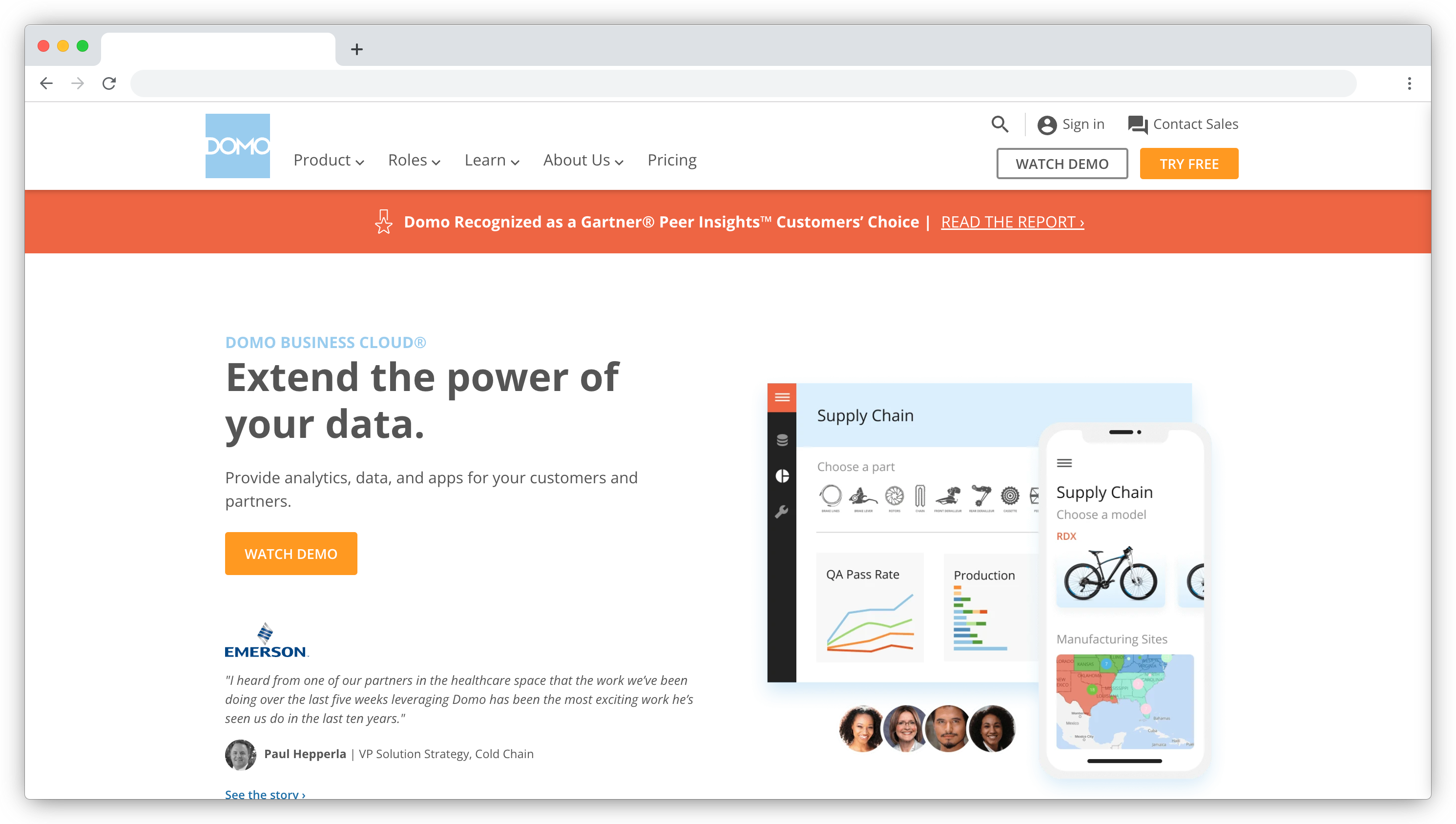
Domo is a data app platform for mid-sized companies and enterprises.
How Domo improves Salesforce reporting:
- Domo can connect Salesforce data to the data from your other BI tools, and build a single, intuitive dashboard.
- With data filtering, you can filter datasets and get the information you need without creating a separate report.
- The tool lets you spot the trends by showing you what your Salesforce data looked like at any point in the past.
- It’s possible to pull data from separate objects in Salesforce, like activities and opportunities, into a single visualization.
Pricing
- You can start exploring Domo for free.
- You will need to reach out to Domo to get a customized pricing plan.
What users say about Domo
“Domo is very intuitive and easy to use. It combines the functionality of spreadsheets, pivot tables, charts, and so much more into customizable dashboards.”
— Jordyn Fox, Financial Planner at Ogle Schools
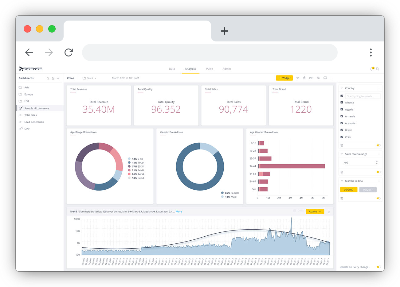
6. Sisense

Sisense is business intelligence software for cross-functional teams.
Mind that contrary to other options on this list, Sisense is not a low-code platform. You need to be tech-savvy to make the most of Sisense.
How Sisense improves Salesforce reporting:
- Sisense combines your CRM data with other data sources to produce more reliable insights on sales performance.
- You can create custom dashboards and set up real-time alerts for a variety of sales KPIs.
- The tool provides you with custom metrics, like deal duration, conversion rates, and individual team members’ performance data.
Pricing
Sisense’s pricing plans aren’t listed publicly. You can reach out to the Sisense team so that they can create a customized solution that meets your needs and fits your budget.
What users say about Sisense
“As an enterprise, you want to make sure you have a system that is flexible and has the ability to save you time. Creating that takes time. But that’s the benefit you get with Sisense.”
— Antonluigi Gozzi, Founder at LiveHire
7. Zoho Analytics

The last tool on our list is Zoho Analytics, a business intelligence and analytics software. Its Advanced Analytics connector for Salesforce helps sales teams to address limitations they face in Salesforce and democratize sales data.
How Zoho Analytics improves Salesforce reporting:
- The platform can slice and dice your Salesforce CRM data to create a report or dashboard of any complexity.
- You can choose from over 100 pre-built reports and dashboards to make the most of your Salesforce data.
- Zoho Analytics offers a range of connectors so that you can include data from any other business solution in your sales pipeline reports and dashboards.
- Users can collaborate with colleagues when creating sales funnels, forecasts, and activity reports.
Pricing
- You can explore Zoho Analytics for free, without access to business app connectors.
- Paid plans start at $24/month.
What users say about Zoho Analytics
“We run a high-intensity sales and marketing operation and have to integrate data from many different sources (leads, prospects, client data) with our internal data.
Using a BI analytics package like Zoho Analytics allows us to perform analysis with all these sources without having to integrate external data with our own databases.”
— Owen Swift, President at Swift Scientific
8. Databox

Databox is a business analytics platform that allows companies to monitor, report and analyze their performance in one place, from any device, in real-time. The platform integrates with 100+ business tools, including Salesforce.
How Databox improves Salesforce reporting:
- Monitor your Salesforce data in one place through an interactive dashboard that updates in real-time and is accessible across various devices (i.e. mobile, TV, Apple Watch).
- Build your own Salesforce dashboard from scratch with the drag-and-drop DIY Designer or choose from multiple pre-built Salesforce dashboard templates that can be set up in minutes.
- Mix and match your Salesforce data with other data sources in one dashboard to get a complete view of your sales performance.
- The platform also enables setting and measuring progress toward goals, creating custom metrics, sharing and automating Salesforce reports, getting notifications when specific metrics are on or off track, and much more.

Pricing
- The free Databox plan includes up to three connected data sources, three users, daily data updates, three dashboards, and one month of historical data.
- Plans with additional data sources and users, more frequent data updates, more historical data, and additional features start at $47/month.
What users say about Databox
“As a reporting tool, Databox has been a central pillar to all our business processes. Unlike the reporting tools we had in the beginning, Databox covers a large number of use cases. Not only has it made our reporting easier, but it has also reduced the amount of time spent on creating reports by a mile.
The Databox-Slack integration is definitely one of the greatest things about this tool. How and when your team gets their updates will always determine workplace effectiveness. The ability to update the team on autopilot has been crucial for our company.”
— Linda Thompson, Notta
Improve Salesforce reporting with the right tools
Which Salesforce reporting tool is best for you? The answer depends on your company's size, budget, and goals.
Check out the tools listed above to find the right tool for creating Salesforce reports for your company.
Looking to learn more? Check out these guides:


